I feel like music magazine I
have created fits within the conventional genre of the magazines I have
analyzed.
Masthead
The masthead of my
magazine reads ‘waves’ I have chosen this name because as it is a music
magazine I was inspired by sound wave, I thought that ‘sound waves’ may not look
good as a mast head on a magazine so I decided to shorten it down to waves.
This way it keeps in with the looks of a conventional magazines masthead as the
average title is no more than 5 letters. The font I used for my title in the
end was Arial black, I had changed my mind over the course of creating my
magazine and I found that having a simple bold text was best as it fitted in
with the conventional side and it made it easily readable. It also still links
to my original idea in a more professional looking way. A masthead on a
conventional magazine should be located at the top of the page, these examples
of some of the magazines I have show that they are also slightly to the left. I
placed mine at the top of the page because I thought that this would be the most
convenient place on the page, also other convenient magazines have located the
mastheads there. However I didn’t put mine on the left hand side like these
other ones but the reason for this was I felt like the mast head would stand
out more and it fit the page better with my picture.
Images and camera work
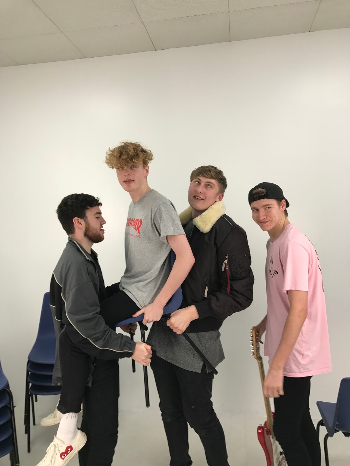
For the images I took I
tried to take in mind the different types of camera shots e.g. close up etc. I
have tried to make sure that I used these different shots and angles as much as
I could in my magazine. The reason I went through the effort of all if this is
because I found that it would be more interesting for the reader of they have a
varied amount of images. I found that most conventional magazines use a range
of camera shots therefore I tried to get a mixture of close ups, medium and
long shot. These can be important because it also gives the reader a different
perspective of the artists, for example a long shot is good because the reader
can then see what they are wearing and could take inspiration from their
outfit. I have also kept a plain
background in all my pictures because I felt that it made them look more
professional and it mainly focuses on the artist this way. I also made sure
that I used the same camera for all of my photos; the reason for this is so
that there isn’t a difference in quality in the pictures. I took all my
pictures on an IPhone 7 at first I didn’t know if this would have a suitable
camera so in my first shoot I used both a Nixon D32100 and the IPhone 7 but I found
they delivered the same quality once uploaded and printed out. The reason I
chose the IPhone over the camera was because I could keep all the photos on me
at all times and I found that if I ever needed to edit the picture it was a lot
easier to do it on the phone Instead of the camera. Another thing that had an
impact on the quality of the picture was the lighting, I had the use of 4 lamps
and I had them in specific places to create different effects, mainly to do
with shadowing. All three of the conventional
magazines use different camera shots; fader uses a medium close up, with a bit
of a busy background. DIY uses a medium to long shot, with an orange backdrop,
which makes it, stand out more. ID uses a close up shot with a plain creamy
background. My magazine, waves, uses a medium to long shot with a plain back
round. My model is in a similar position to the DIY front cover models, as my
model is also sitting down.
Genre of magazine
The genre of magazine I
have chosen is within the ‘indie’ music genre, this genre is again starting to
become a trendy genre again with a teenage audience. There has been a recent
increase of indie bands emerging now that the audience is there. The music is
mainly based around the teenage life and happy times so there for it attracts
mainly a teenage fan base, so because of this I will base my target audience on
teenagers to young adults, from the ages 15-21 years old. Even though I want my
magazine to be mainly focused around indie music, the magazine I have made has got
an indie rapper as the front cover and double age spread so it focuses on more
than just indie style, my artist reminds me a bit of Loyle Carner, as his genre
is indie/ rap. Fader magazine seems to
be mainly based on the hip-hop genre, both music and culture. DIY is classed as
an indie magazine aimed at about 16- 20 year olds, for a ‘cool’ and ‘edgy’
audience. ID is more mainstream/ alternative that plenty readers will find
appealing because it’s a good magazine for a wide audience.
How are the artists
represented?
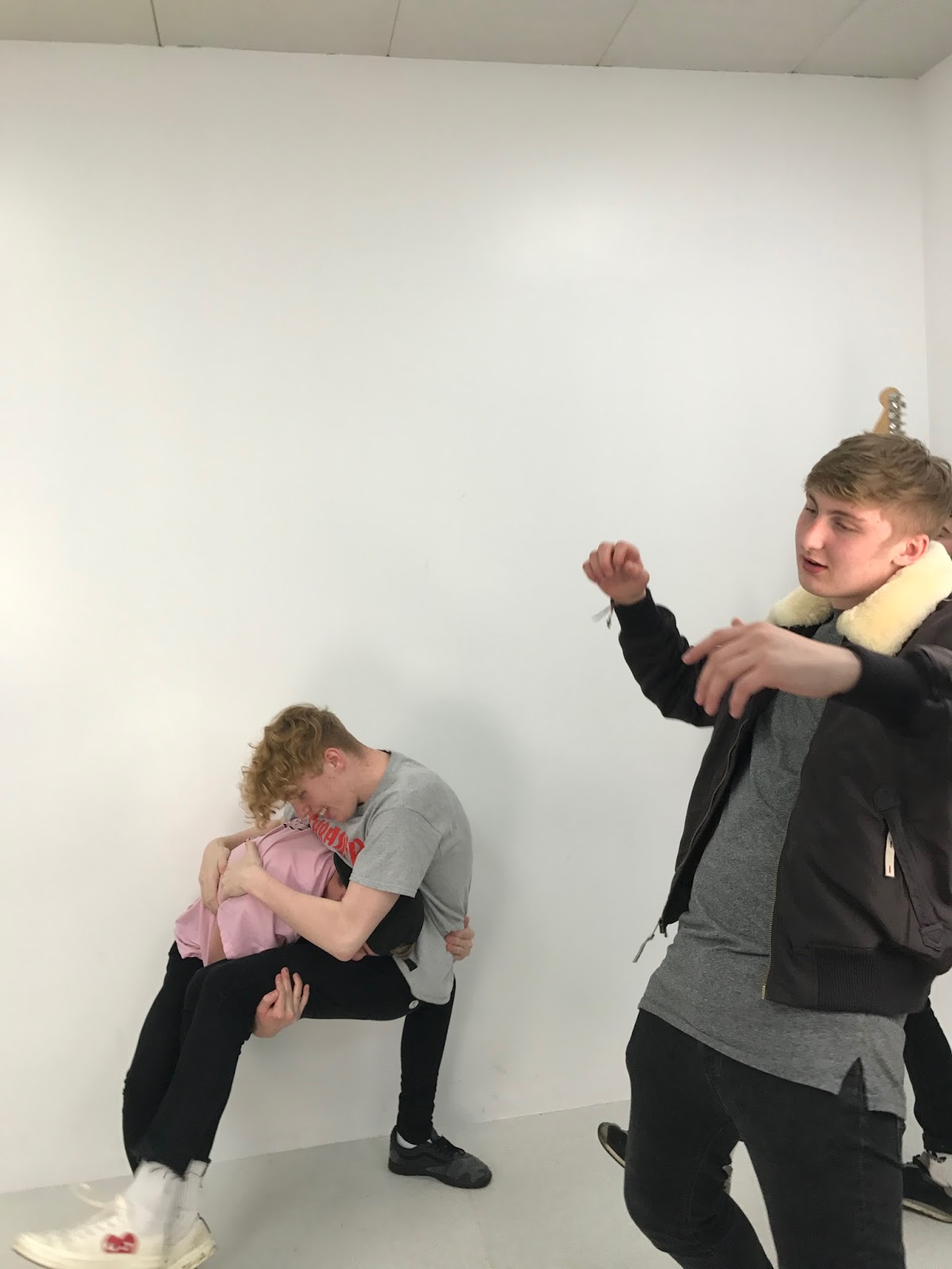
In my magazine my artist is
represented as quite an empowering figure as the pose he is doing looks like
someone who isn’t scared and is in charge. My artist is seated but je is quite
spread out and is looking straight into the camera, this shows that he has
confidence behind him. The reason I chose this photo is because I want him to
come across as a little ‘cocky’ and that he isn’t scared of the music industry.
With this authoritative image I used it so people would take him seriously as
he is still young I have made it so people know that he’s serious. Fader
represents their artist in a basic medium close up shot; they have got their
artist to stand out even though he is wearing basic black and white clothing.
Even though these coulors would usually not stand out but he background is quite
vibrant and is blurred out leaving him in focus. The flowers in his hands kind
of represent a soft side to the artist and he is in quite a casual picture as
if he’s being himself and isn’t fully posing. DIY magazine features two artists
sitting down on chairs in a kind of casual looking pose, there style is more
fitting of the indie clothing style, for example the straight jeans and rolled
up at the bottom. The whole front cover
is pretty simplistic with big impact, this is shown as the background is plain
but the colour orange they have chosen makes it stand out more than the average
cover, the chairs they’re sitting on aren’t fancy and they can barely be seen.
All of this fits in with the current indie scene as its quite stripped back. The
next magazine has quite a different representation of the artist because it is
the only one with a close up consisting of just the face and shoulders. The
artist looks quite unconventional compared to the other magazines.